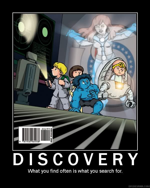
I rarely talk about the art in comics because I'm not much of an art critic, but I'm going to make an exception for this cover. What's great here is the use of shadow here - it looks like the cover to a kids' horror/mystery book, which foreshadows the events in the book. Surprisingly, more mainstream comics aren't this clever.
No comments:
Post a Comment