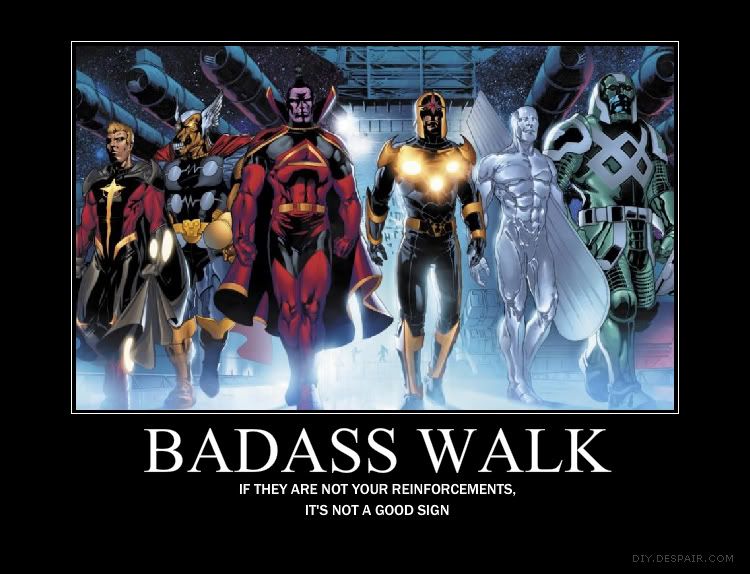
Alright people, I'm going to need your help on this one - I want your opinion as to how to prioritize my poster-making macros.
Most of you already know that my default has been DIY.DISPAIR.COM. However, recent changes means that they no longer scale down long titles, so now "GUNSLINGER WALK" is too long a title to use even in landscape for most font choices. These others though? I find the image quality and size too small for my tastes, and not nearly as versatile when it comes to cropping the images. Your thoughts are appreciated.


No comments:
Post a Comment